A Guide to Descriptive Statistics
Descriptive stats offer a way to comprehend and review data in a clear and understandable way. By using different statistical methods, we can gain knowledge about a dataset’s patterns and characteristics. This guide will help you understand the concepts of descriptive stats, helping you to confidently interpret and share your findings.
We’ll investigate key measures like central tendency, variability, and distribution. These measures help us understand the average value of our data (mean, median, mode). Also, its dispersion (range, variance, standard deviation), and how it is spread across different values or types (histograms, frequency tables). With these tools, we can get the basic properties and structures in the dataset.
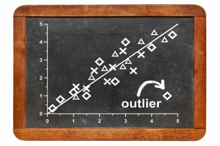
Descriptive stats provide more than just numbers. Visual techniques like bar charts, pie charts, scatter plots, and boxplots enable us to easily detect trends, patterns, outliers, and relationships. These visuals support our understanding by showing information in a precise yet effective manner.
Here’s a tip: When interpreting descriptive stats, think about the context the data was collected in. Acknowledging any limitations or prejudices in the sampling process helps guarantee accurate results. Also, remember that descriptive stats are only part of the storytelling process; they form the basis for further analysis and decision-making.
By mastering descriptive stats and applying them correctly in research or work, you’ll be able to extract meaningful insights from your data. Now let’s explore the world of descriptive stats together!
What are Descriptive Statistics?
To understand descriptive statistics, delve into its definition and importance. Define the concept and explore why it holds significance in data analysis. By grasping these fundamental aspects, you can effectively apply descriptive statistics as a solution to analyze and interpret data sets with confidence.
Definition of Descriptive Statistics
Descriptive statistics is the branch of stats that describes and summarizes data in a helpful way. It arranges, presents, and examines the data to give understanding and patterns that people can get. Here’s what it involves:
- Measures of Central Tendency: These measures give one value that stands for the middle or average of the data set. This includes mean (average), median (middle value), and mode (most frequent value).
- Measures of Dispersion: These measures show how clustered or spread out the data points are. You often use range, interquartile range, variance, and standard deviation for this.
- Frequency Distribution: This means arranging data into intervals and counting the number of observations in each interval. It helps you see how values are spread out over different ranges.
- Graphical Representations: Numbers don’t usually make sense to people. This is why descriptive statisticians show the data with graphs, charts, and plots. Histograms, box plots, bar charts, scatterplots, and pie charts are common.
Descriptive stats also have measures like correlation coefficients to look at relationships between variables or attributes.
Remember: Descriptive stats is the starting point for more stats analysis and hypothesis testing. It helps researchers find patterns, recognize outliers or anomalies in data sets, and draw conclusions based on facts.
Importance of Descriptive Statistics
Descriptive stats hold a key role in analyzing and understanding data. By organizing numerical info, they give us priceless tips for making informed decisions. We can see the tendencies, changes, and distributions of data sets. This lets us spot trends, recognize outliers, and make better predictions and conclusions.
Measures such as standard deviation show us the spread of data points around the average value. Skewness shows if the distribution is even or lopsided to one side. Kurtosis tells us how pointed or flat a distribution curve is. These measures help us understand complex patterns in the data.
Descriptive stats are needed in today’s data-run world. They tell us about customer behavior, market trends, and performance metrics that shape strategic decisions. Without these statistical tools, we could miss out on great opportunities to grow and improve.
Don’t wait any longer! Jump into descriptive statistics and unlock the power of your data! Let these numbers bewitch your imagination and guide you to a more successful future. Don’t let your rivals gain an edge while you’re unaware of the wonders hidden in your datasets. Adopt descriptive stats today and use their transformative power to stay ahead in this speedy world!
Types of Descriptive Statistics
To gain a comprehensive understanding of types of descriptive statistics, explore measures of central tendency, measures of dispersion, and measures of shape. These sub-sections provide solutions to effectively analyze and summarize data, allowing you to grasp the central values, variability, and distribution shape of your dataset with greater clarity.
Measures of Central Tendency
The table displays three commonly used measures of central tendency: mean, median, and mode.
Mean adds up all values then divides by the total count, making it sensitive to outliers. Median is the middle value when data is sorted and is robust to outliers. Mode identifies the most frequent value in the dataset.
For further understanding:
- Mean is a useful measure when dealing with symmetrical datasets without any extreme values.
- Median works best with skewed data or datasets with outliers.
- Mode is crucial when categorical variables and frequencies are significant.
Knowing these nuances helps us to choose the appropriate measure for accurate data representation and analysis.
Mean
The mean, also known as the average, is a key measure of central tendency. It’s found by adding up all values in a dataset and dividing by the total number of values.
Let’s see an example:
Value 1, Value 2, Value 3, and so on till Value n;
x-bar equals the sum of all values divided by total number of values.
So, to get the mean, we add up all values and divide it by the total. This gives us a value that represents the center of the data.
Note, the mean is sensitive to extreme values. This can alter its accuracy. So, when interpreting the mean, it’s essential to check outliers or influential observations.
Knowing how to work out and interpret the mean lets us gain insights from data and make smart decisions. Don’t miss out. Start analyzing your data today!
Median
The median is a statistic to split a collection of data in two pieces. It is the middle value when ordered in increasing or decreasing order. Let’s take a gander at this table:
| Data | Median |
|---|---|
| 10 | 6 |
| 12 | 8 |
| 15 | 9 |
| 18 |
From this table, we can see that when sorting it in ascending order, the median is the middle number, which is 9. It is a powerful way to measure the central tendency and is great for lopsided data or outliers.
Pro Tip: When we use an even number of observations, the median is the mean of the two middle values.
Mode
The mode is a descriptive stat that shows the most common value in a data set. It gives us an idea of what the data looks like.
Let’s look at an example. Say there’s a data set of student test scores: 80, 85, 90, 90, 95. In this case, the mode is 90 because it appears twice and no other value appears more than once.
Let’s look at the mode in a table:
| Data Set | Calculation | Result |
|---|---|---|
| 80, 85, 90, 90, 95 | Count frequency of each value | Mode: 90 |
By analyzing different datasets using the mode, we can find out what’s popular. This can be useful in market research, sports analysis, and quality control.
Fashion designers also use mode. They find out which styles or colors are popular among consumers. With this, they can create new collections with a higher chance of success.
Measures of Dispersion
Dispersion is key to understanding descriptive stats. It reveals how much a data set is scattered or close to the central tendency. We can measure dispersion to find out if data is spread widely or not.
See table below for measures of dispersion:
| Measure | Description | Formula |
|---|---|---|
| Range | Difference between max and min | Max – Min |
| Variance | Average squared dev from mean | Sum of (each – mean)^2 / num |
| Standard Deviation | How much variance from mean | Sq. root of variance |
| Mean Absolute Deviation | Avg. dist. from mean | Sum of abs. diffs/num |
| Coeff. of Variation | Rel. measure of variation | (Std. dev./mean)*100% |
Additionally, Quartiles divide a dataset into 4 equal parts: lower Q (25%), median (50%), and upper Q (75%). These help analyze data distribution further than just central tendency.
Leonardo faced a problem with two datasets. They had identical means, but different variances. Just using the mean wouldn’t give him enough info about them. He was able to make an informed choice after considering measures of dispersion. This improved his decision-making process.
Range
The range is a measure that indicates the spread of a dataset. It’s found by subtracting the min value from the max value. E.g., for a dataset of heights, the range is the difference between the tallest and shortest person.
Take a look at this table:
| Height (in inches) |
|---|
| Person 1: 65 |
| Person 2: 68 |
| Person 3: 62 |
| Person 4: 71 |
To calculate the range, find the largest and smallest values. Here, 71 inches is the largest, and 62 inches is the smallest. Subtracting gives a range of 9 inches.
The range gives information about the spread of data, but not the shape or distribution. To get a better understanding, consider other measures, like standard deviation or interquartile range.
To determine the range of a dataset, find the difference between the maximum and minimum values. But, it’s important to consider additional measures for a more complete analysis.
Variance
Variance is a statistical measure that shows the spread of a dataset. It gives an idea of how much each data point differs from the mean. To understand it better, let’s make a table.
We’ll use this dataset as an example: 2, 4, 6, 8, and 10. Here’s the table:
| Value | Deviation from Mean (x – μ) | Squared Deviation ((x – μ)^2) |
|---|---|---|
| 2 | -4 | 16 |
| 4 | -2 | 4 |
| 6 | 0 | 0 |
| 8 | +2 | 4 |
| 10 | +4 | 16 |
To figure out the variance, we need to find the mean. In this case, it’s (2+4+6+8+10)/5 = 6. Then, for each value in the dataset, we subtract the mean and square the result. The sum of these squared deviations divided by the total number of values gives us the variance.
To improve our understanding of variance, these tips help:
- Increase sample size. Bigger sample sizes give better estimates of population variances.
- Remove outliers. They can make the variance calculation skewed.
- Standardize units. Make sure all variables have the same unit before calculating variance.
By following these suggestions, accuracy increases and bias is reduced when using variance for description.
Standard Deviation
Standard Deviation: a measure of variability in a dataset. Calculated by taking the square root of the variance, it indicates how spread out the data points are from the mean. Unlike measures like range or quartiles, it considers all data points and takes into account both the magnitude and direction of deviations from the mean.
Fascinatingly, this concept was introduced by Karl Pearson in 1893!
Measures of Shape
Types | Description
————
Skewness | Lack of symmetry in distribution.
Kurtosis | Degree of peakedness or flatness in distribution.
Outliers | Extreme values that deviate from pattern.
Percentiles | Divides data into equal groups.
These measures can help us spot outliers. They let us compare and interpret our data in various contexts.
Understanding and using measures of shape helps us make better decisions. Don’t miss out on utilizing these tools for your statistical analysis!
Skewness
Skewness is the measure of asymmetry or lack of symmetry in a dataset’s distribution. It can show us whether the data is skewed to the left (negative skew) or right (positive skew). Skewness helps us know the shape of the distribution and make guesses about the population.
A table can explain skewness better. It looks like this:
| Distribution | Skewness |
|---|---|
| Normal | 0 |
| Positive Skew | > 0 |
| Negative Skew | < 0 |
The table tells us that when skewness is 0, the distribution is perfect. If it is greater than zero, the tail of the distribution is on the right side leading to a positive skew. When it is less than zero, the tail is on the left side, resulting in negative skew.
Skewness helps us find outliers. For example, if stock market returns have a negative skew, there are more extreme negative returns than extreme positive returns. This can help investors make decisions.
Kurtosis
Kurtosis is a statistical measure that looks at the shape of a data distribution. It tells us if it’s heavily tailed or peaked compared to a normal one.
It examines the tails to determine the extent of extreme observations in our dataset. See the table for comparison of the Kurtosis values:
| Values | Distribution Type |
|---|---|
| <1 | Platykurtic (Flat Distribution) |
| =1 | Mesokurtic (Normal) |
| >1 | Leptokurtic (Heavy-Tailed Distribution) |
These distinctions give us useful information about our data, making it easier to analyse.
Fun fact: Kurtosis was first discovered by Karl Pearson in 1905 when he researched skewness and moments.
How to Calculate and Interpret Descriptive Statistics
To calculate and interpret descriptive statistics, you’ll need a step-by-step guide, tips for interpretation, and awareness of common mistakes. Start by following the step-by-step guide for calculating descriptive statistics. Then, learn how to interpret the results you obtain. Lastly, be mindful of common mistakes and important considerations to ensure accurate and meaningful analysis.
Step-by-Step Guide to Calculating Descriptive Statistics
Calculating descriptive stats? Crucial! Employ math formulas to gain insights into the central tendencies, dispersions, and distributions of a dataset. Here’s the step-by-step:
- Select your dataset. Numerical or categorical, it’s the foundation.
- Determine central tendencies: Mean, median & mode. To find the mean, add all values & divide by observations. Median is the middle value when in ascending order. Mode is the most frequent value.
- Calculate dispersion measures: Range, variance & standard deviation. Range is max – min. Variance is the average deviation from mean squared. Standard deviation is the variation relative to mean.
- Examine shape & distribution: Visualize with histograms or box plots.
- Interpret: Make conclusions based on calculations & trends. Different types of datasets may require specific statistical methods. Learn techniques for numerical or categorical data.
Practice regularly with different datasets to master fully. Invest time & effort in building this skill set & harness the power of data!
Interpreting Descriptive Statistics
Descriptive statistics are key to unlocking the meaning of data. They allow us to observe patterns, trends, and distributions in datasets. Here’s a look at their interpretations.
- Mean shows the average value,
- Median the middle value,
- Mode the most frequent value,
- Range the difference between max and min, and
- Standard Deviation measures variability around the mean.
These stats offer unique insights about data, such as its spread, center, and shape. They help detect skewness, normal distribution, and outliers. Comparing different groups with these stats reveals patterns and significant differences. This helps researchers and analysts make informed decisions and hypotheses.
For instance, a medical study analyzing blood pressure readings in various age groups used descriptive stats to uncover an interesting trend. The mean systolic blood pressure for older adults was higher than that of younger individuals. This finding prompted further research into possible risk factors and management strategies tailored for seniors.
Common Mistakes and Considerations
Inaccurate data entry, improper sample size determination, and failure to account for outliers are common mistakes in calculating descriptive statistics. It is crucial to handle these considerations with precision to ensure accurate analysis.
Pay attention to variable types when calculating descriptive statistics, as they may influence how you interpret the results. Moreover, consider using visual representations such as histograms or box plots. Double-check the accuracy of your data entry; select an adequate sample size that represents the population; and be vigilant in detecting and treating outliers.
Mastering the calculation and interpretation of descriptive statistics is essential for making informed decisions. Refine your skills and unlock valuable insights that could drive impactful outcomes!
Examples and Applications of Descriptive Statistics
To gain a practical understanding of descriptive statistics, dive into real-life examples and applications in different fields. Explore how descriptive statistics can be applied to analyze data in various contexts, from finance to healthcare. Witness the power of these statistical tools in action as they unravel insights and patterns hidden within data.
Real-life Examples
Statistics are key for comprehending and interpreting data in many real-life scenarios. Here are some examples to demonstrate the practical uses of descriptive statistics.
Think about a retail store that wants to assess its sales data from different branches over the past year. By using descriptive statistics, they can work out figures such as the average sales per branch, the best and worst selling products, and the overall sales trend. This info helps them make wise decisions about inventory and marketing strategies.
In healthcare, hospitals often use descriptive statistics to analyze patient data. They can figure out things like the age distribution of patients, average length of hospital stay, and prevalence of particular diseases within a population. This helps healthcare providers identify areas for improvement, distribute resources effectively, and monitor disease outbreaks successfully.
Banks also use descriptive statistics to analyze customer behavior. By looking at transaction data, they can detect trends like peak hours for withdrawals or deposits. This data allows them to optimize their operations by allocating staff correctly and having enough cash available at ATMs during busy times.
To guarantee precise market research, companies employ descriptive statistics in studying survey results. They can calculate central tendencies such as mean or median scores for diverse demographic groups. This permits them to gain precious insights into consumer preferences and adjust their products or services suitably.
To make the most of descriptive statistics:
- Use fitting graphical representations like histograms or box plots to illustrate data patterns.
- Make sure the collected data is accurate before carrying out any analysis.
- Attend to outliers or extreme values that may affect general trends.
- When comparing datasets, consider measures like standard deviation or interquartile range besides relying only on averages.
By following these tips, folks and organizations can exploit the power of descriptive statistics to get significant insights from data and make informed decisions in many fields. Keep in mind – numbers have stories to tell!
Applications in Different Fields
Descriptive statistics are used in many fields in various ways. Let’s explore some applications of this data analysis technique.
For example, universities like Harvard use it to evaluate student performance. They analyze test scores and identify areas where further instruction is needed. This helps improve educational outcomes.
In finance, mean, median and mode are calculated to assess market trends and make investment decisions.
In healthcare, statistical measures are used to analyze patient data for research and improve medical treatments.
Marketers rely on descriptive statistics to understand consumer preferences. Surveys and demographic data are studied to develop targeted advertising campaigns.
In sports, player stats are analyzed to assess performance, create strategies and make decisions during games.
These applications show the versatility of descriptive statistics. It is used in many industries, from education to finance, healthcare to marketing and beyond.
Conclusion
Descriptive statistics provide a great insight into data. It helps researchers to understand and interpret data in an organized way. This makes it an important tool in statistical analysis.
Descriptive statistics assist researchers to summarize big data. It presents the information clearly, without overwhelming readers.
It also has the ability to show information graphically, through charts and graphs. These visuals assist to comprehend trends, patterns, and connections between data. This makes it easier to communicate the findings.
An example of the importance of descriptive statistics is the case of Simon Newcomb. During the early 19th century, he used various equipment to measure the speed of light. With data collection and analysis, he was able to determine the accurate value for the speed of light. This great success was only possible due to descriptive statistical methods.
Additional Resources and Further Reading
Get ready to boost your descriptive statistics knowledge! Explore online courses from platforms like Coursera, Udemy, and edX. Read books such as “The Art of Statistics” by David Spiegelhalter and “Statistics For Dummies” by Deborah J. Rumsey. Dive into scholarly articles from renowned journals like the Journal of Statistical Software or the Journal of Official Statistics.
Engage in discussions and seek guidance from experts on platforms like Stack Exchange and Quora. Network with statisticians and access valuable resources from professional communities like the American Statistical Association or the Royal Statistical Society.
Check out podcasts like “Data Skeptic” and YouTube channels like “Khan Academy” for engaging audiovisual content. Find resources that match your needs, from foundational knowledge for beginners to advanced topics for experienced learners.
Make the most of this data-driven world! Embrace lifelong learning and stay ahead with additional resources for descriptive statistics.
Frequently Asked Questions
1. What is descriptive statistics?
Descriptive statistics is a branch of statistics that involves summarizing and organizing data to provide meaningful descriptions of the data set. It includes measures such as mean, median, mode, standard deviation, and range.
2. How is mean calculated in descriptive statistics?
The mean is calculated by summing all the values in a data set and dividing the sum by the total number of values. It represents the average value of the data set and is often used as a measure of central tendency.
3. What does the standard deviation measure?
The standard deviation measures the amount of variation or dispersion in a data set. It tells us how spread out the values are from the mean. A higher standard deviation indicates greater variability.
4. What is the difference between median and mode?
The median is the middle value in a data set when the values are arranged in ascending or descending order. It is not affected by extreme values. The mode, on the other hand, is the value that appears most frequently in the data set.
5. How is the range calculated?
The range is calculated by subtracting the smallest value from the largest value in a data set. It gives an idea of the spread or dispersion of the data. However, it does not provide information about the shape of the distribution.
6. When is it appropriate to use descriptive statistics?
Descriptive statistics is commonly used to summarize and describe data in various fields such as finance, economics, psychology, and social sciences. It helps in understanding the basic characteristics of data and making meaningful interpretations.
- What Polls Reveal About Sleeping Together Early and Long-Term Relationship Success - July 7, 2025
- How to Design a Hard Harry Potter Trivia Challenge - October 4, 2023
- How to Design a Dear Peachie Makeup Preference Poll - October 4, 2023
